 Image 1 of 2
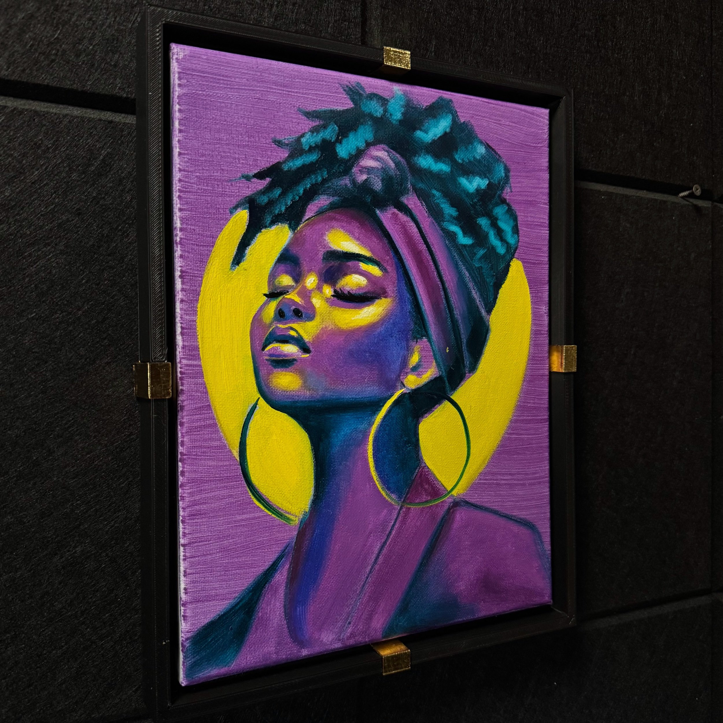 Image 2 of 2
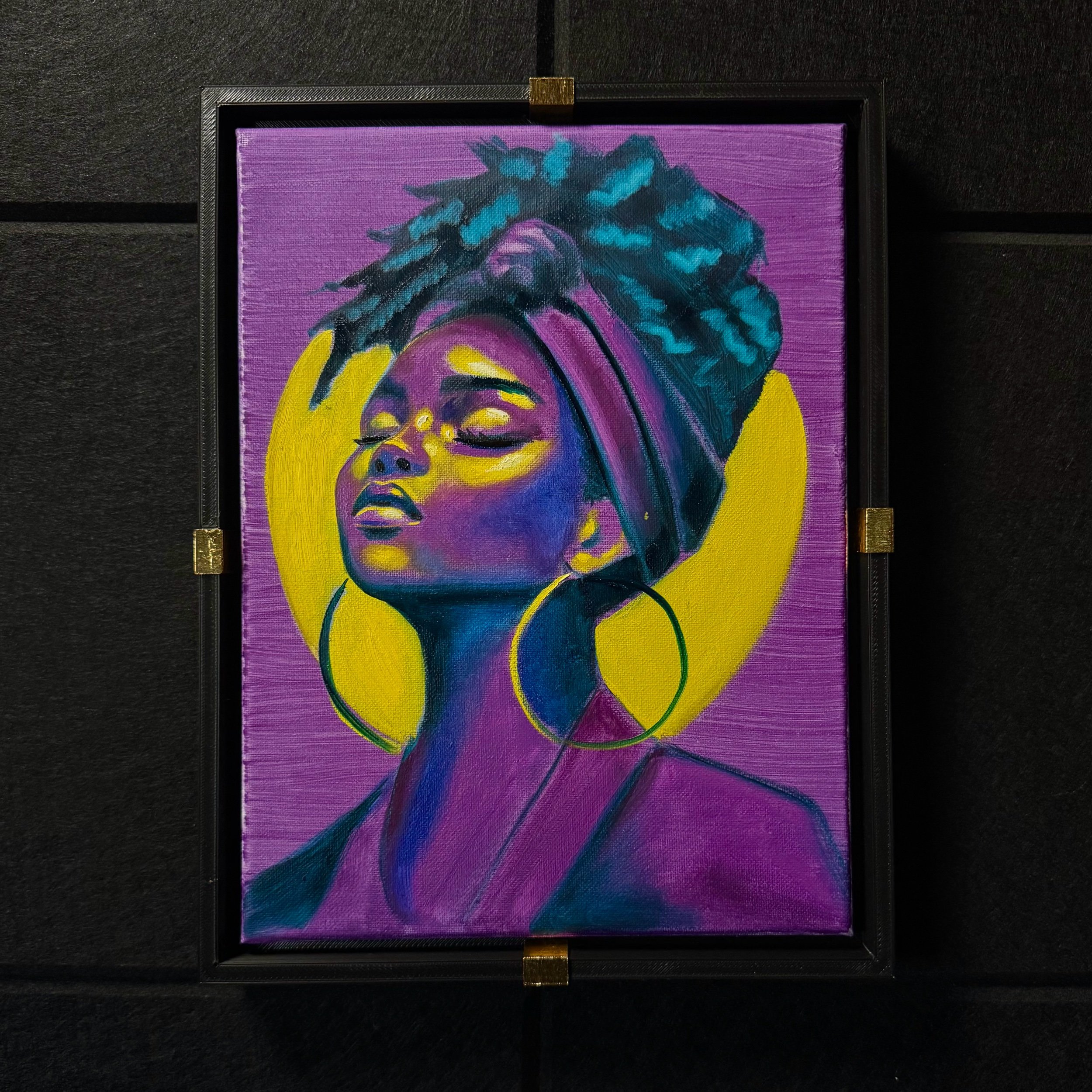
One of the simplest ways to create powerful color harmony is by building a painting around a small group of colors that naturally balance each other.
I started with purple as the midtones in this series.
For the darkest values, phthalo turquoise, and yellow for the highlights.
Because yellow and purple sit opposite each other on the color wheel, it's natural contrast and vibe.
Adding a cool blue-green like phthalo turquoise deepens the shadows without turning them muddy.
A few quick tips when experimenting with color like this:
Choose a dominant midtone because it becomes the foundation everything else reacts to.
Use complementary colors for highlights to create visual energy.
And try to push shadows cooler or deeper, not just darker. This keeps the painting luminous.
Sometimes limiting the palette is exactly how to expand you understanding of color
Size: 9x12
Type: Oil on Canvas
*Custom frame included